Debug VR
—
A critical research into the status quo of virtual reality
Food For Thought
—
Publication of a personal research into culinary hacking
North Sea Jazz Poster
—
Poster design for the annual North Sea Jazz poster contest
Air Force
—
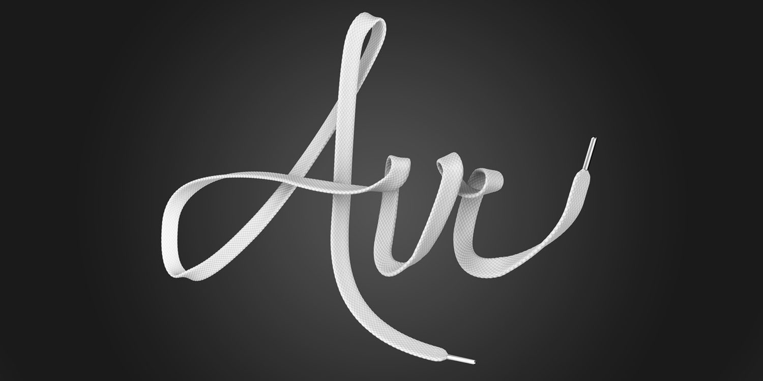
3D typography piece as tribute to Nike Air Force
This Is Fit
—
Brand identity for a bootcamp start-up
1km² Internet
—
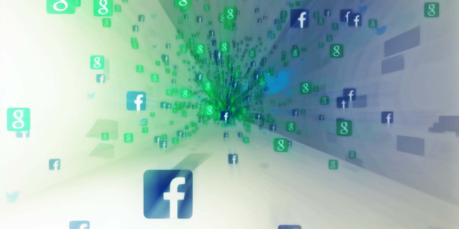
An interactive virtual reality journey through the physical internet
Typhoon Animation
—
Handdrawn animation to a song from Typhoon
Freedom Poster
—
A poster design, rebelling against the contest's rules
A is for...
—
An Animated Alphabet
Creating Pioneers
—
Branding proposal for a conference on design and education
GGD Samen Starten App
—
Redesign for healthcare workers app
Contact
Freek Rutkens
Graphic Designer
freek@greativity.nl
(+31) 6 39 79 88 64
Ledeboerstraat 4
2035 TC Haarlem
Debug VR
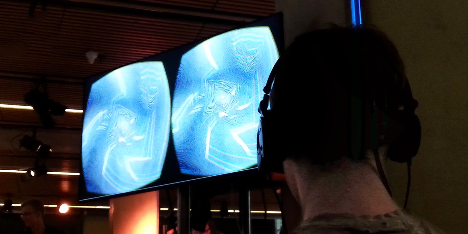
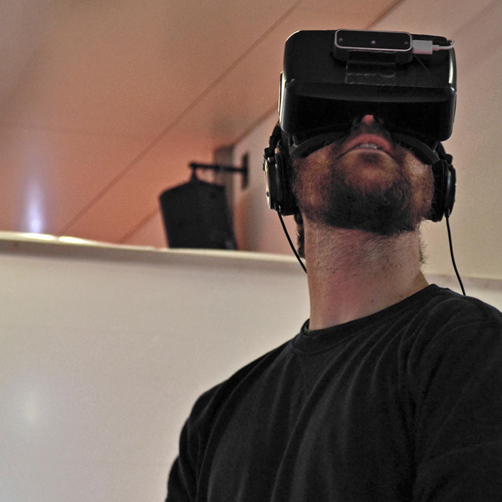
This project is all about exploring the medium virtual reality, and reaching out to its potential. Together with Jeroen Pronk, I started a critical research into VR. Our vision and findings are translated into nine experienceable and interactive virtual environments.
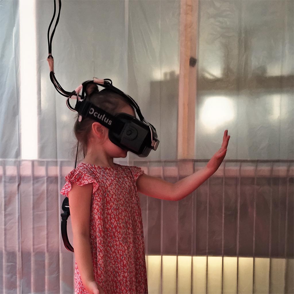

The current state of virtual reality is still very much based on 'reality' as we know it. The physical world and current digital conventions dictates the design and use of virtual reality. We thought this is a shame, because there is so much more to VR than we can possibly imagine at this point. Without restrictions like space, location and laws of physics, the possibilities seem endless.
Decades of using digital media, has made us very conditioned. This makes it very hard to rethink purposes, interaction and navigation of new, revolutionary media. To break through these barriers, we began experimenting and researching in every way we could think of. Case studies, philosophizing, wireframing, dialogue and loads of trial and error brought us a more refined and critical vision towards VR.
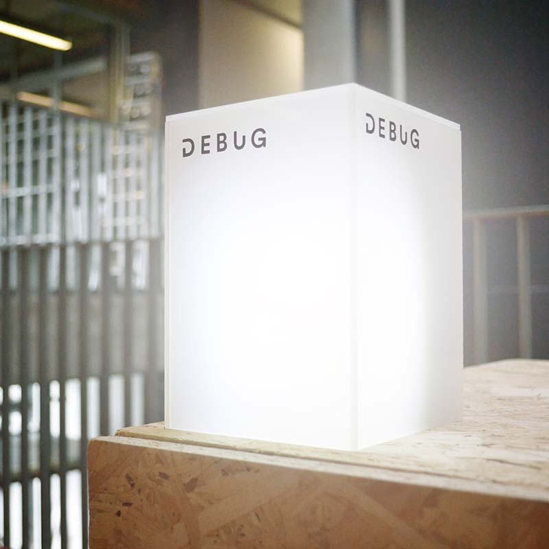

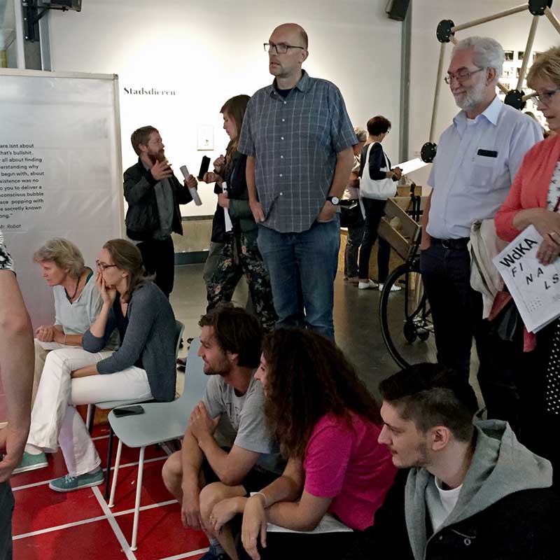

Experiencing our artistic research in VR
From our pile of research, we selected the most valuable and interesting data to use in our VR project. In the end, we translated our visions and research findings into nine spatial virtual reality environments. Some of which are very functional, focusing on the conventions and language of VR. Others are a bit more meta and philosophical; how do you define virtual space? To whom does it belong?
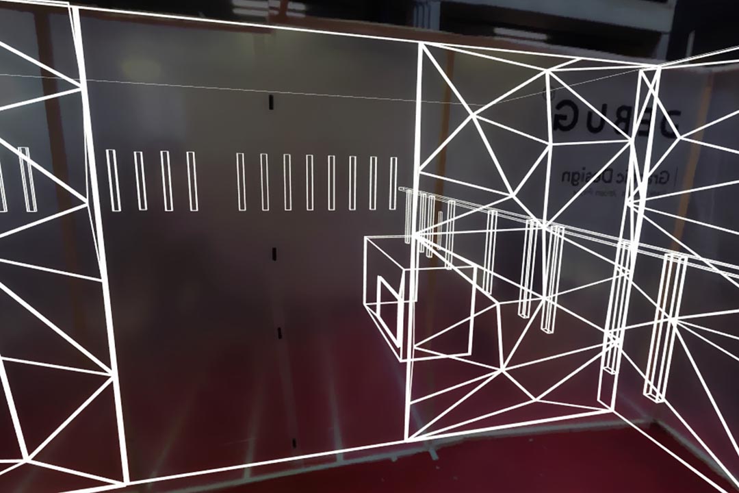
Introduction Area
—
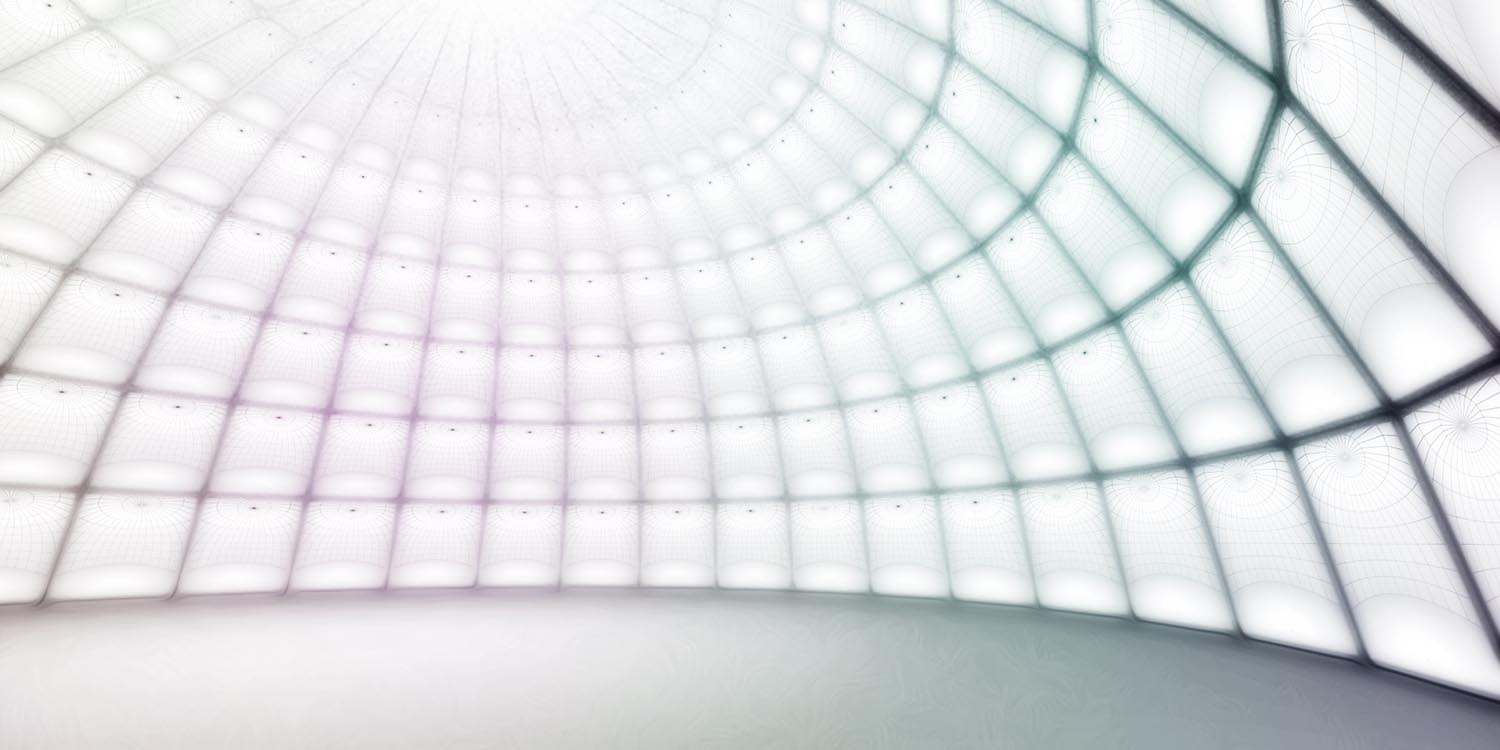
An environment that gradually transfers the user from the realtime surrounding to the virtual one. This has proven to be a crucial aspect for the most immersive experience.
Instruction Area
—
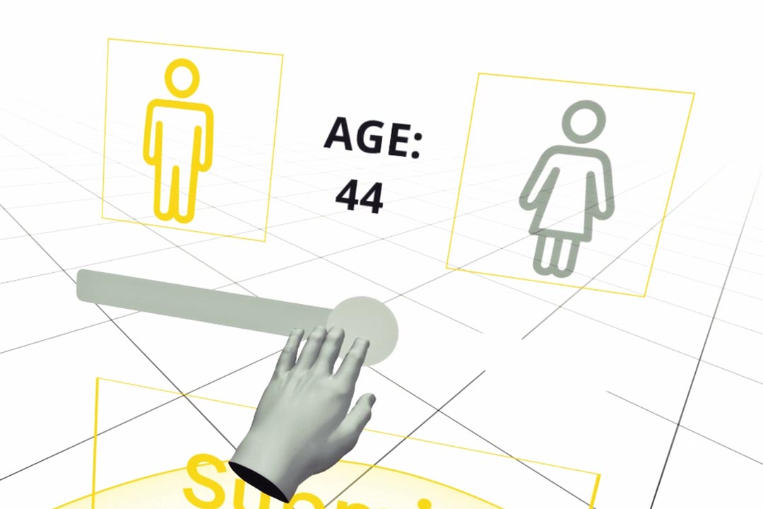
In order to achieve an immersive experience, the navigation and interaction should feel as natural and intuitive as possible. This is why every user has to complete a few simple tasks, to make sure they don't get lost at a later point.
Main Environment
—
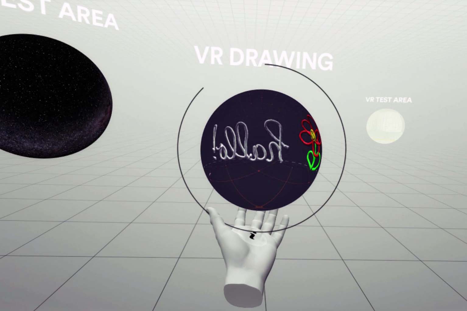
The index of our project. From here, the user can navigate to the other six environments.
VR Real Estate
—
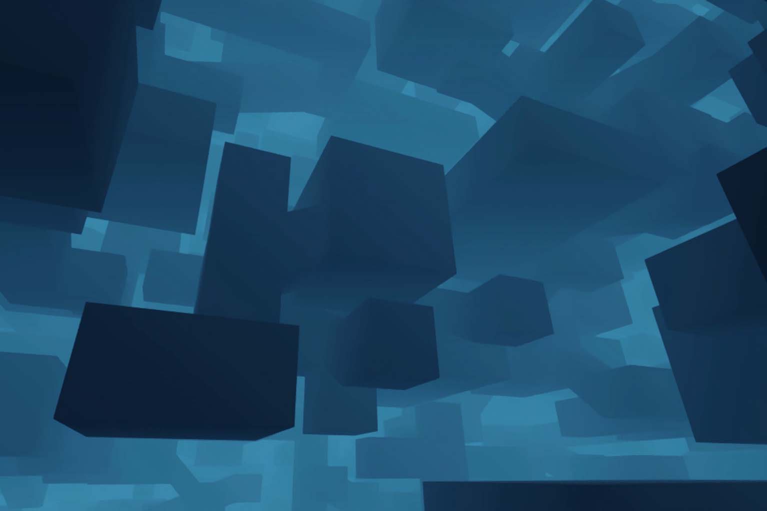
A bit philosophical apporach to the concept of virtual space. In this environment, we want to question how one defines virtual space. Where is it located? Who does it belong to?
Social VR
—
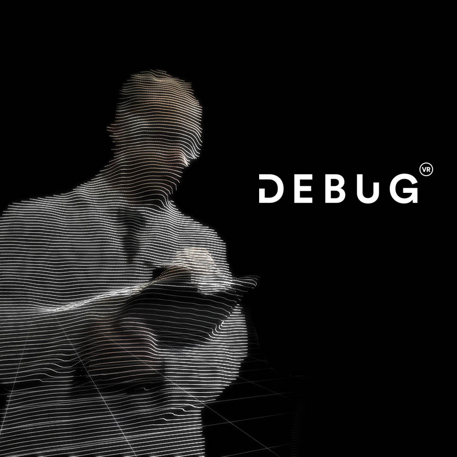
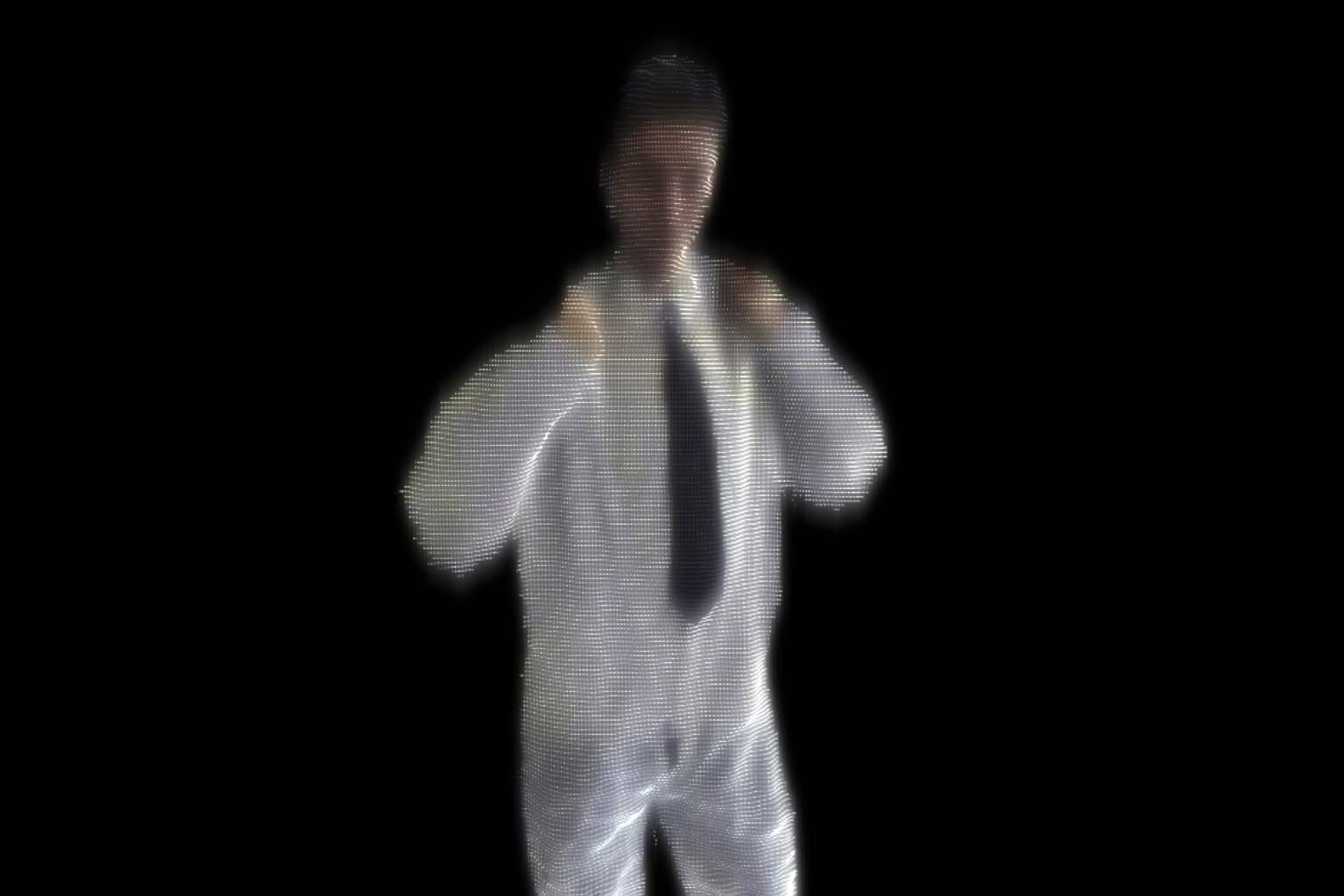
In this area, we present our vision on social VR, by using RGB-Depth video captures. Social VR is a promising concept that's been heard very often, but to us it still feels very shallow right now.
360 Photo Area
—
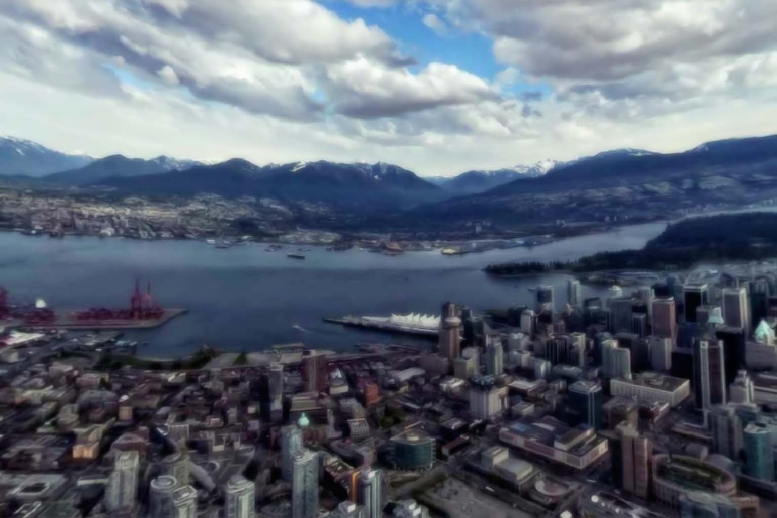
In this area we put the potential and limitations of 360 degree photographs in virtual reality to the test.
VR Test Area
—
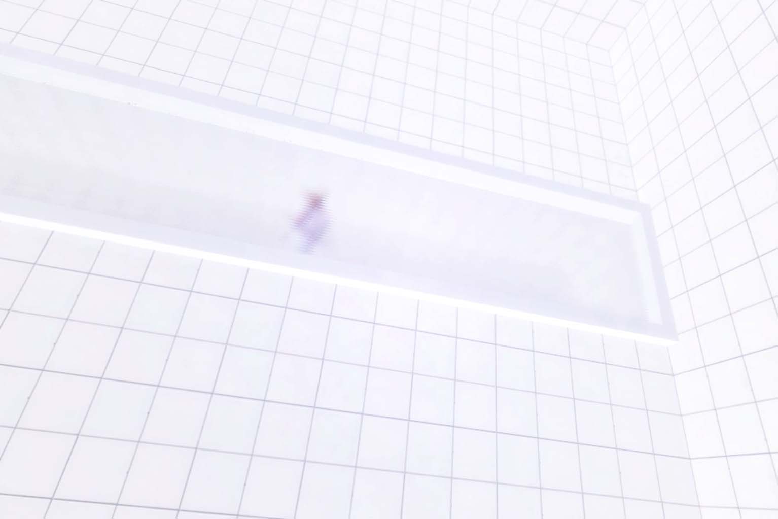
Virtual reality — especially the technology — still has a lot of limitations. In this area we put our users to the test with the nauseating flaws of VR.
VR Drawing Area
—
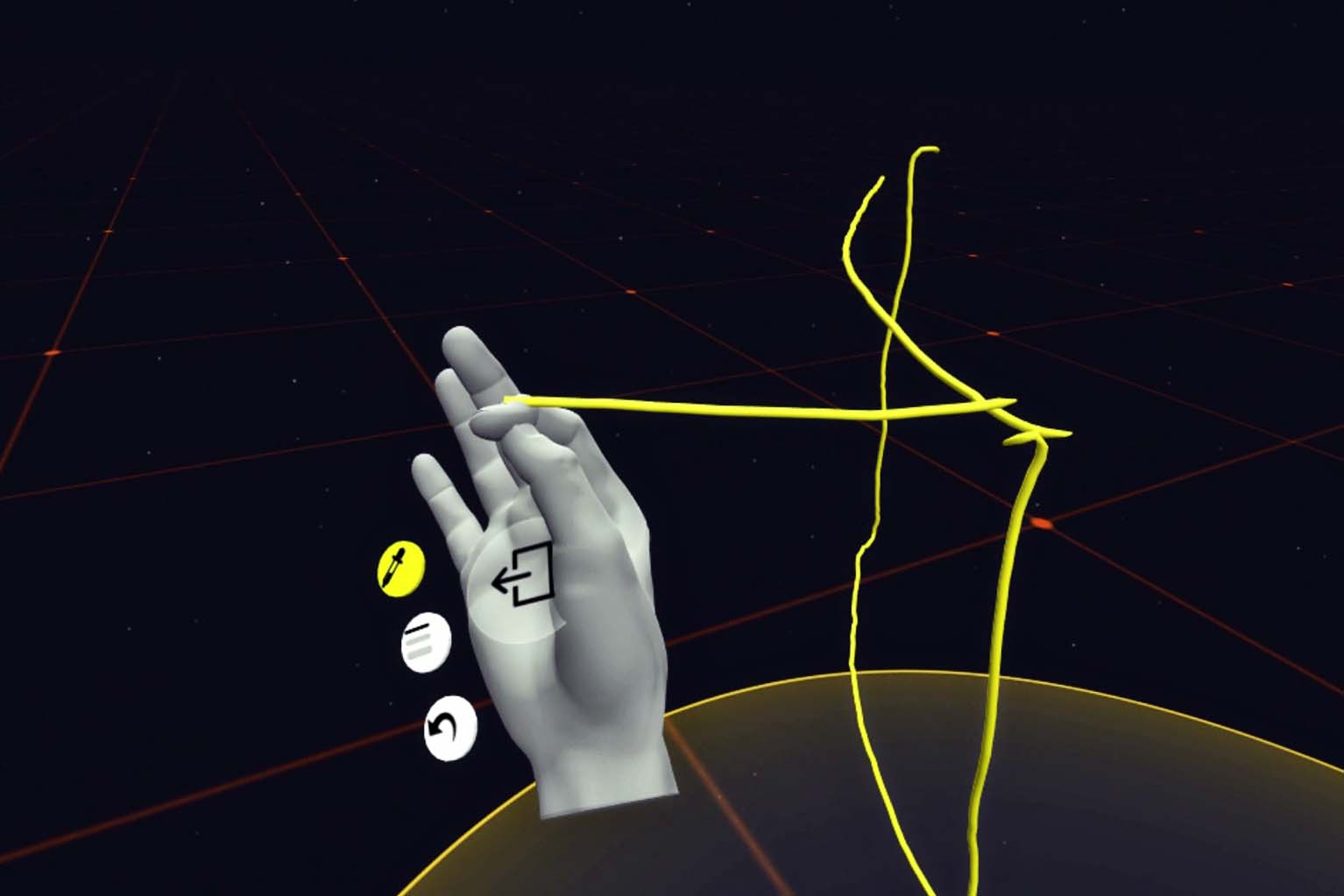
An interactive, three-dimensional canvas to unleash the user's inner artist!
VR Solar System
—
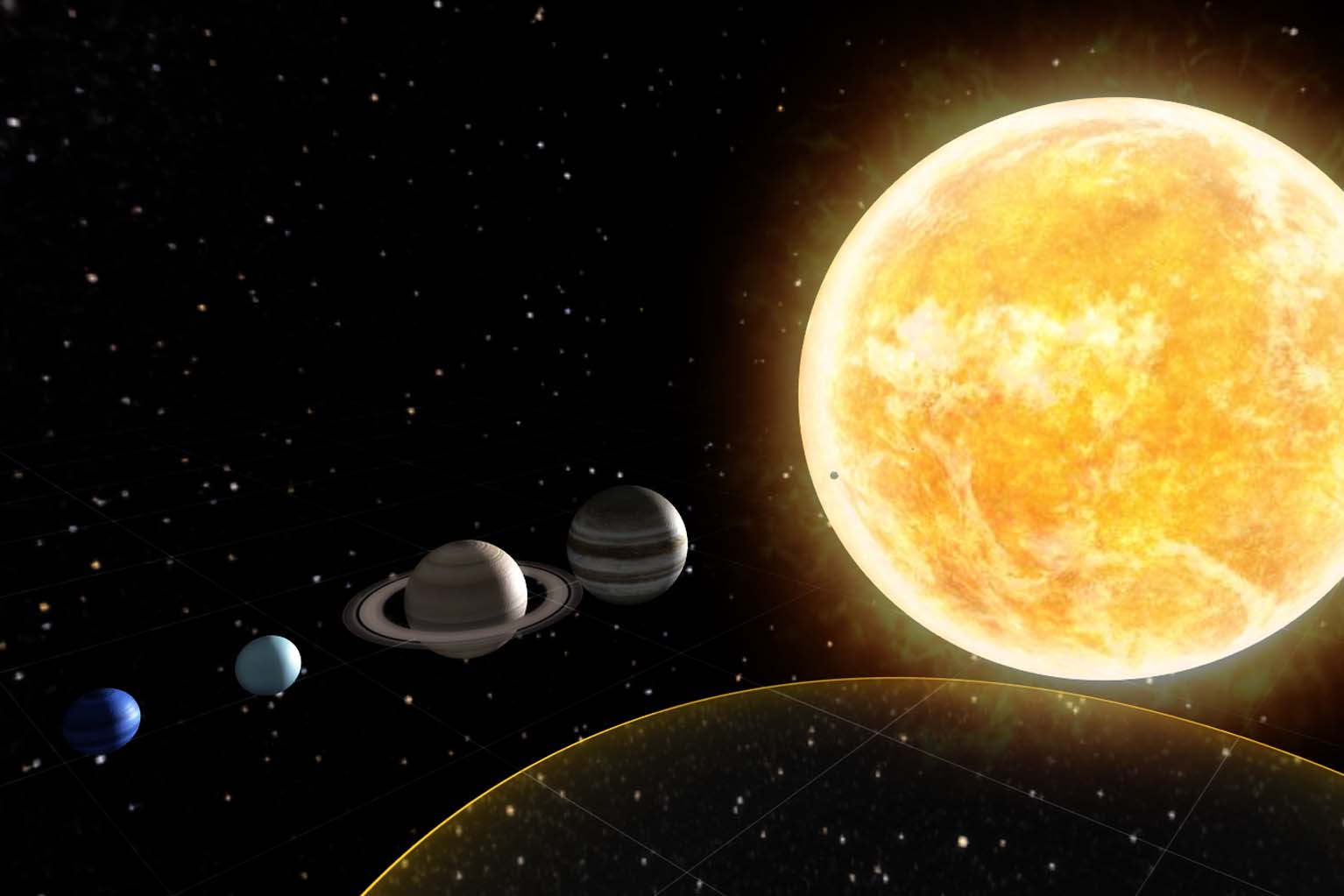
An environment dedicated to the potential of educating in VR. After all,experiencing something has way more impact than reading something in a book.
Food for Thought
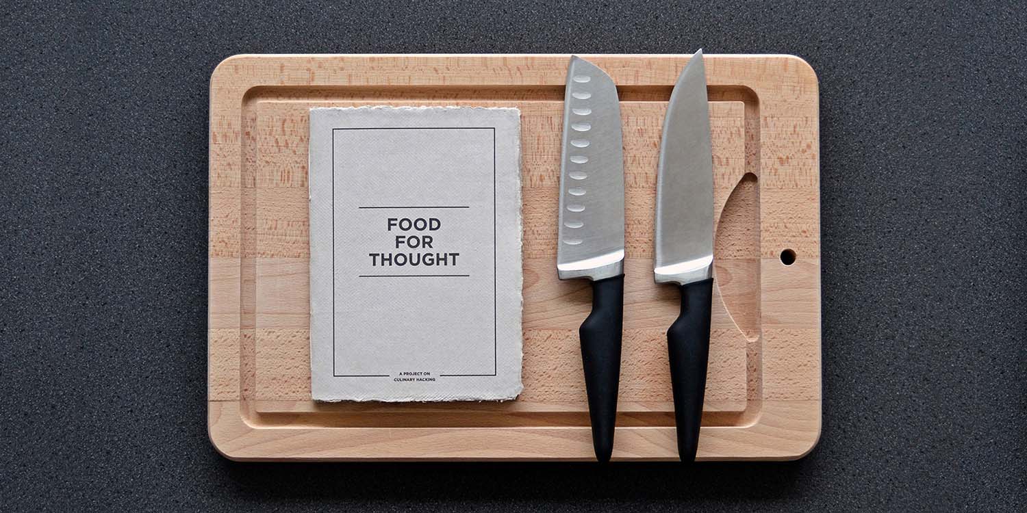
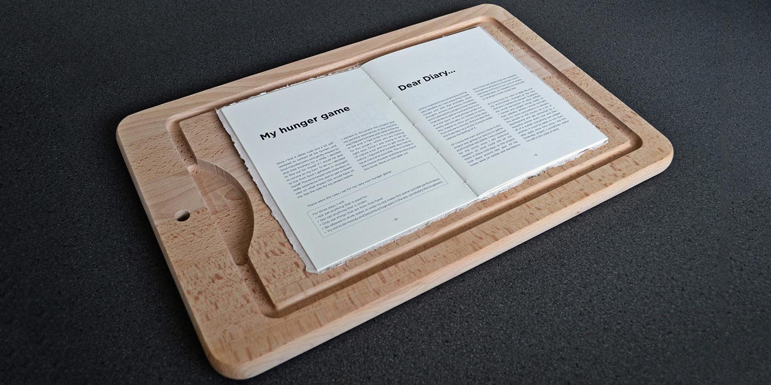
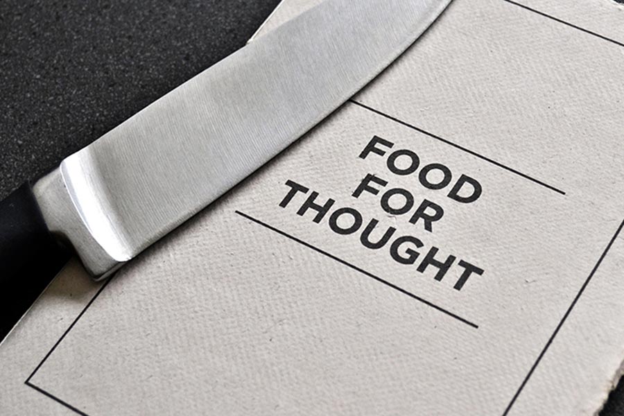
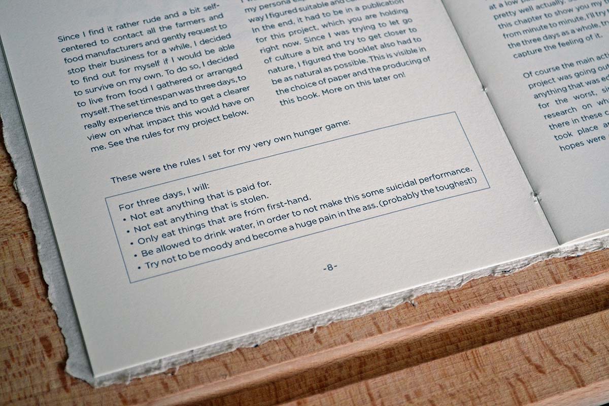
In order to research our conditioned nature in terms of food consumption, I set myself a goal to surive for three days on food gathered solely from nature. This publication is a personal journal in words and images about these three days.
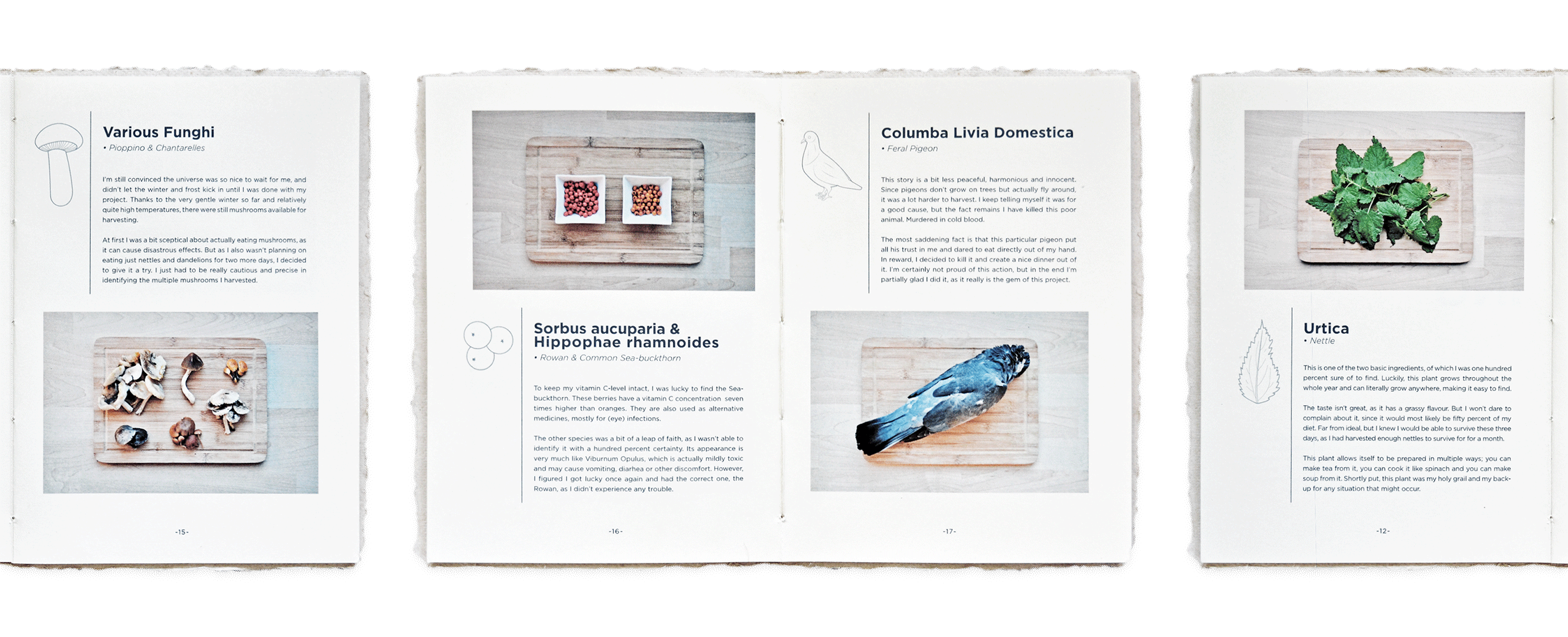
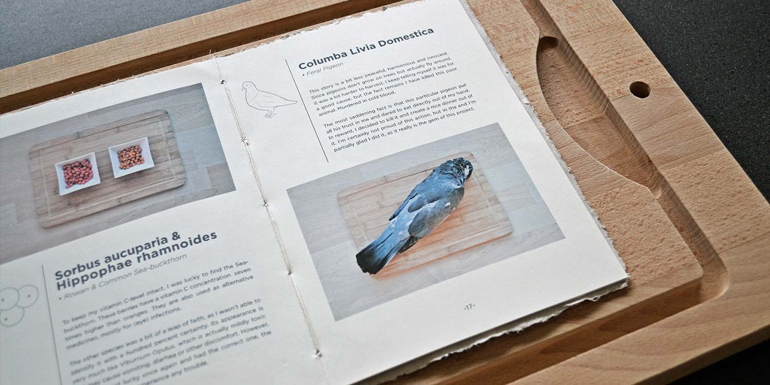
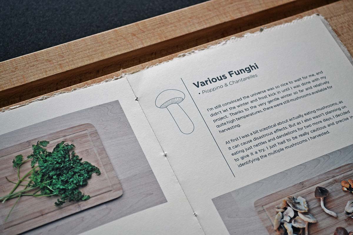
Apart from the horrible timing — during the depths of winter — this project was a really fun and eye-opening experience. Even I, with no experience in permaculture at all, could pretty easily survive in the harsh winter season, when nearly nothing grows.
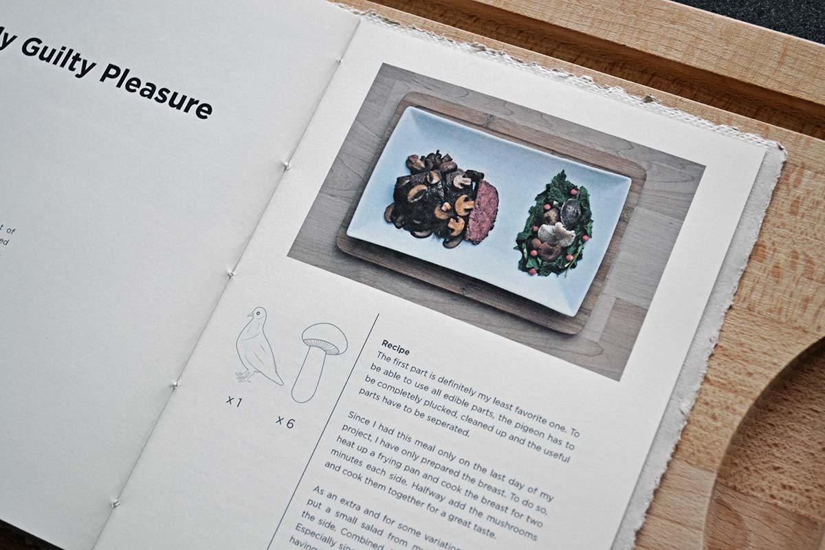
The things I did find and harvest, are documented in this publication, along with the meals I was able to cook with them. I'm still not sure whether it was my primal instinct or the hunger that drove me, but the pigeon I had on the last day was really the icing on the cake!

North Sea Jazz Poster
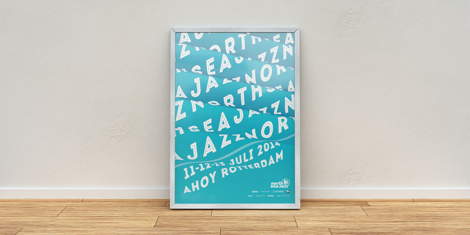
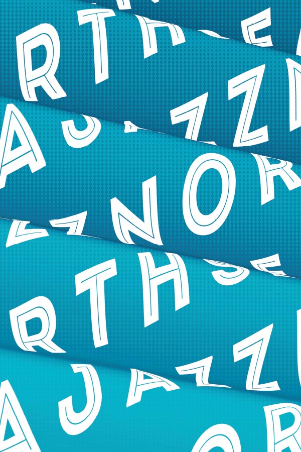
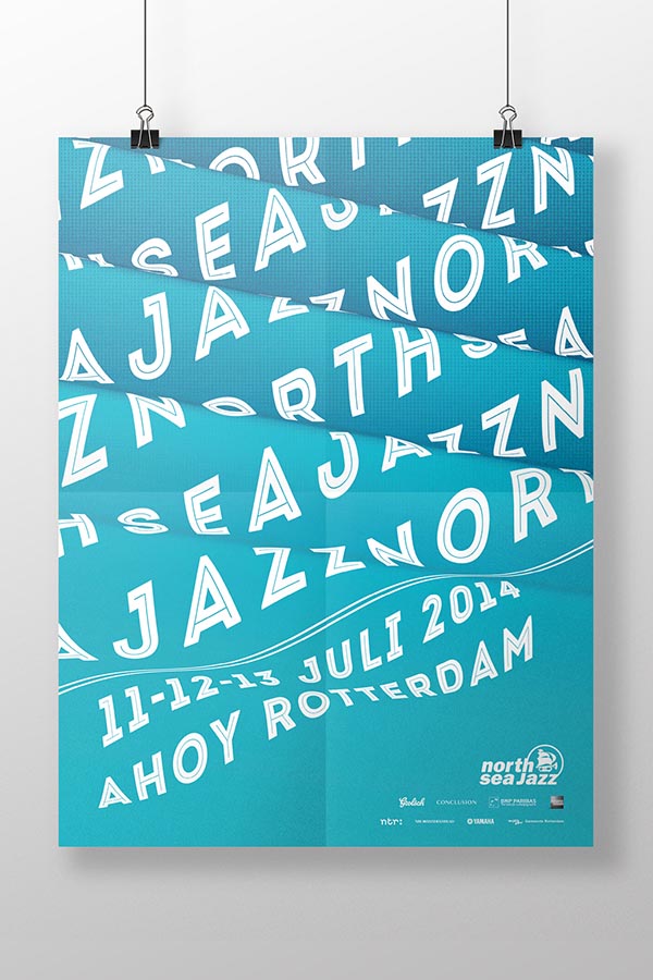
This work was my entry for the poster contest of North Sea Jazz, an annual jazz festival in Rotterdam. It was awarded with a spot in the poster exhibition prior to the event.
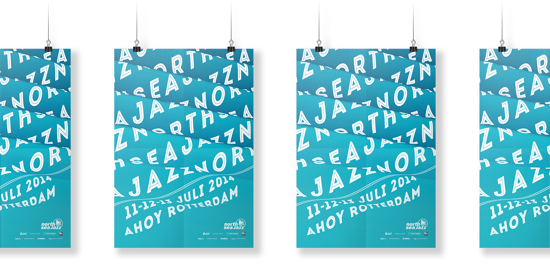
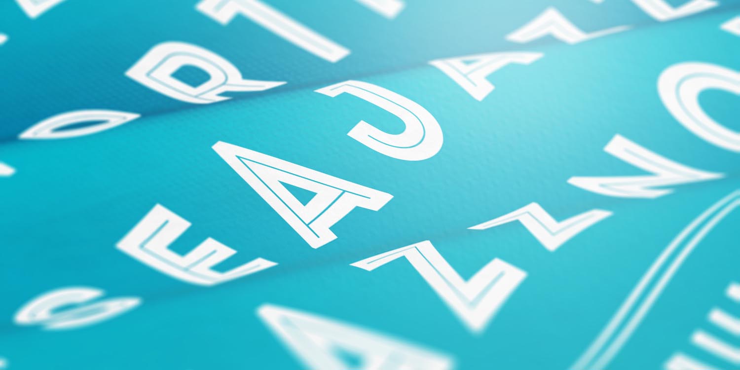
The annual North Sea Jazz poster contest is known for the competitive spirit between students from various art academies. A jury, including the board of the festival, picks the fifteen best entries, as well as the winning design. My aim with this poster was to create an image that combines the easy, soothing rythm of jazz, with an abstract image of the North Sea.
This Is Fit
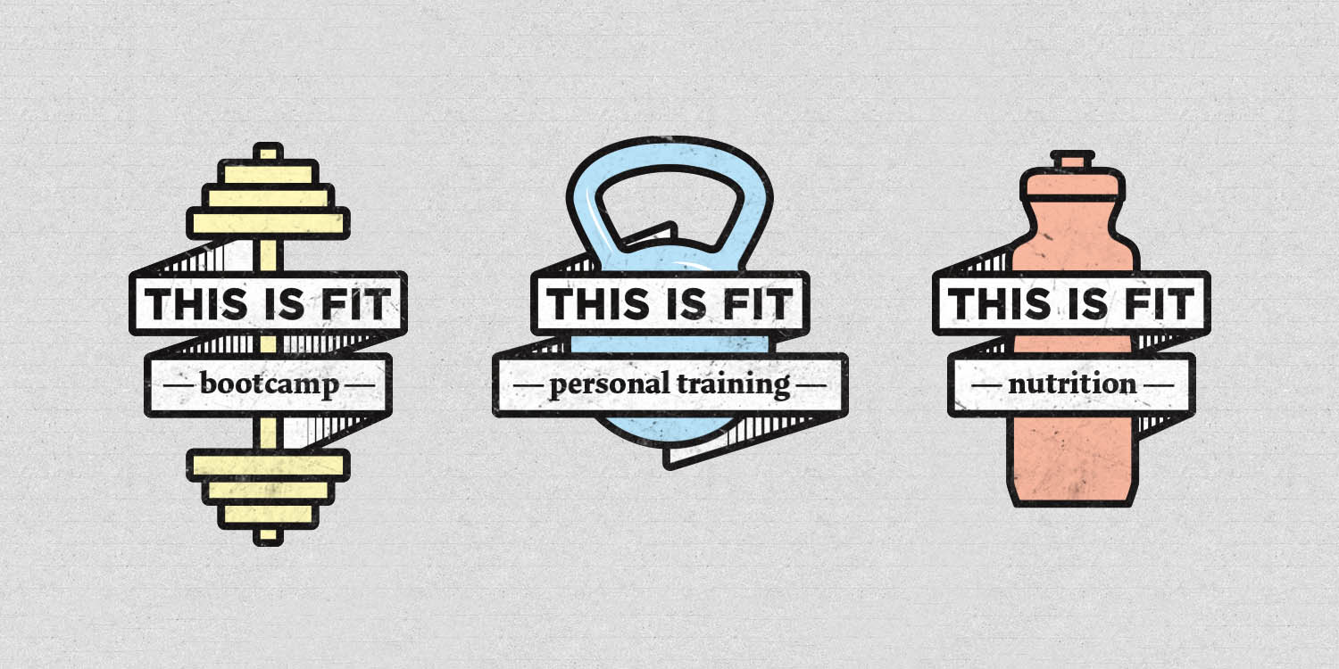
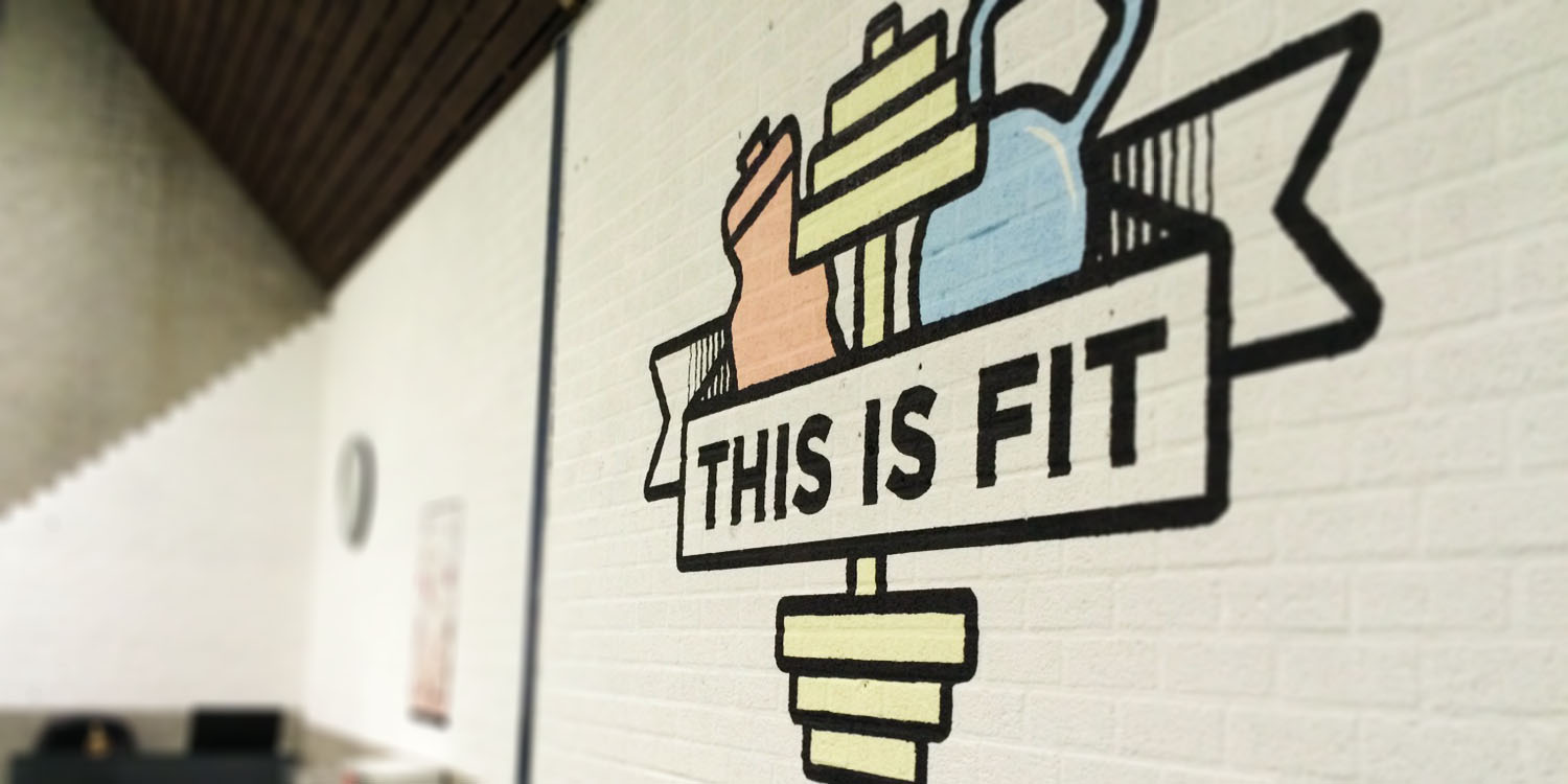
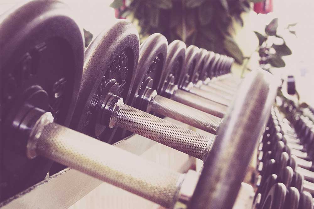
This Is Fit is a bootcamp start-up, which also offers diet programmes and personal training. To communicate this unique set of services, the visual identitiy also consists of three seperate components.
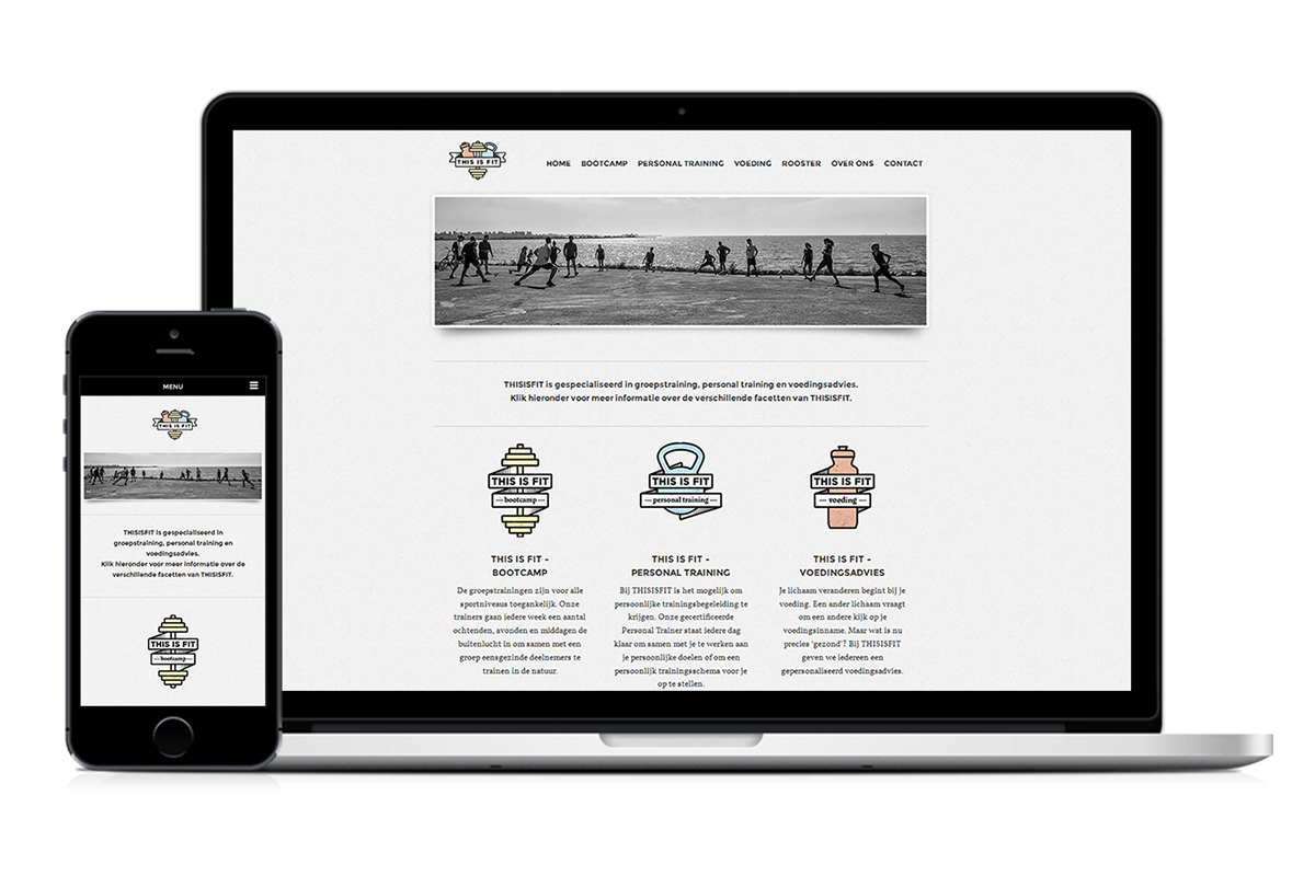
Apart from creating an identity with three different faces, it was important to keep in mind how the identity would be applied; mostly as logo's on (trainers) outfits and training accessoires, as well as for online communication. This resulted in a clear, bold identity that can easliy be applied to their needs.
Air Force
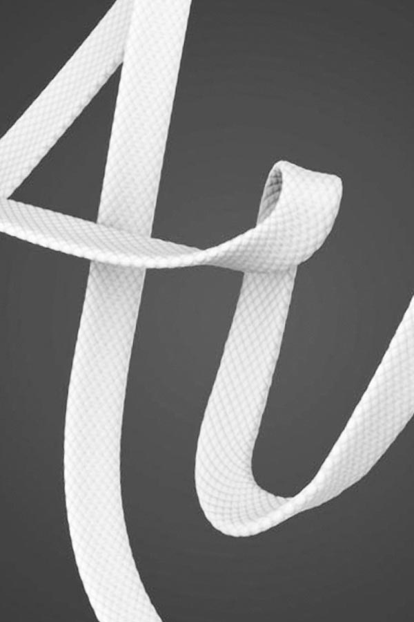
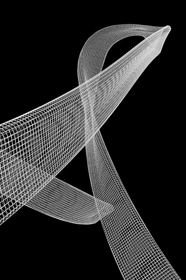
This personal typographic piece is the result of a form and material study in 3D modeling and rendering. It's also a tribute to my all-time favorite sneaker: Nike Air Force.
1km² Internet
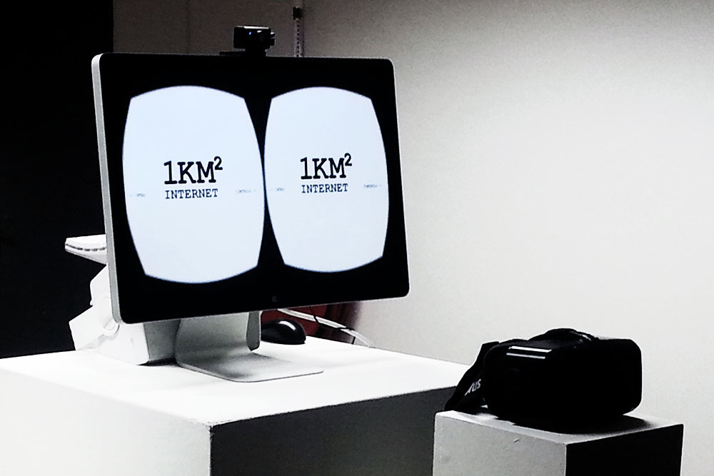
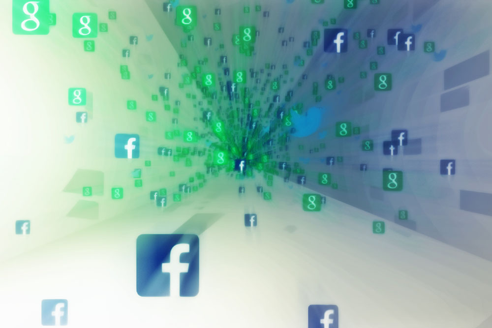
In this virtual reality experience, the internet comes to life in a spatial, almost physical way. What would it feel like to be uploaded? Or to experience a connection error? Who is keeping an eye on you?

Typhoon – Zo Niet Mij
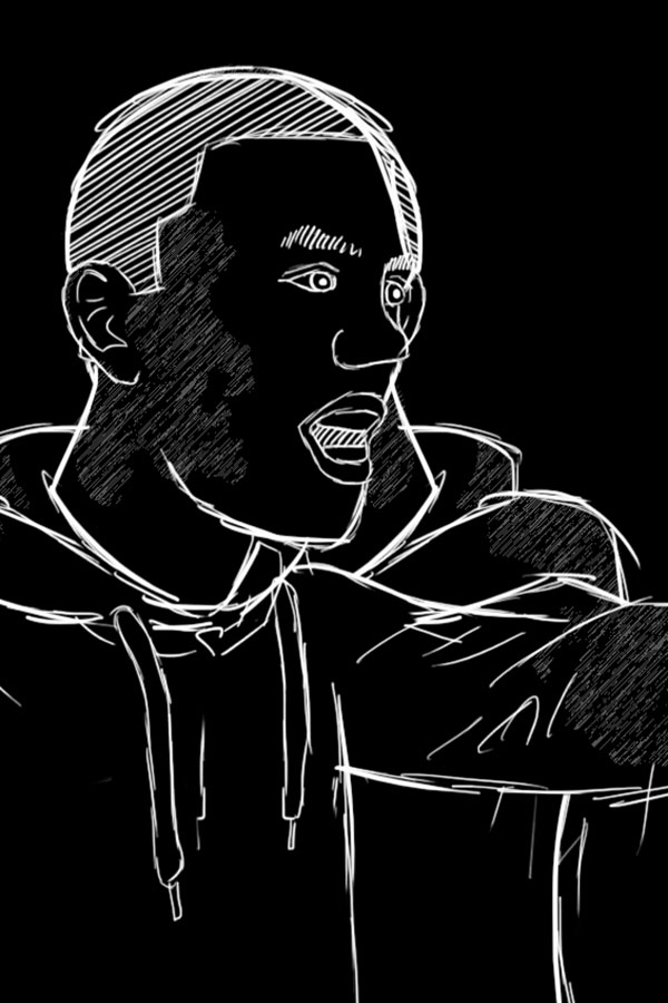
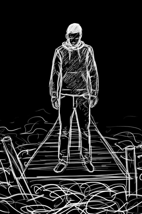
This work is a personal and free project from my first year at the art academy: a handdrawn animation of the last verse from "Zo Niet Mij", a song from Dutch hip-hop artist Typhoon.
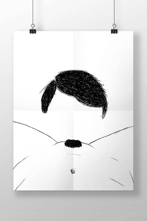
Freedom Poster
This poster design was my answer to a poster contest about freedom, pitched by the city of The Hague. The awarded posters, picked by the jury and the city council, were to be exhibited in a gallery.
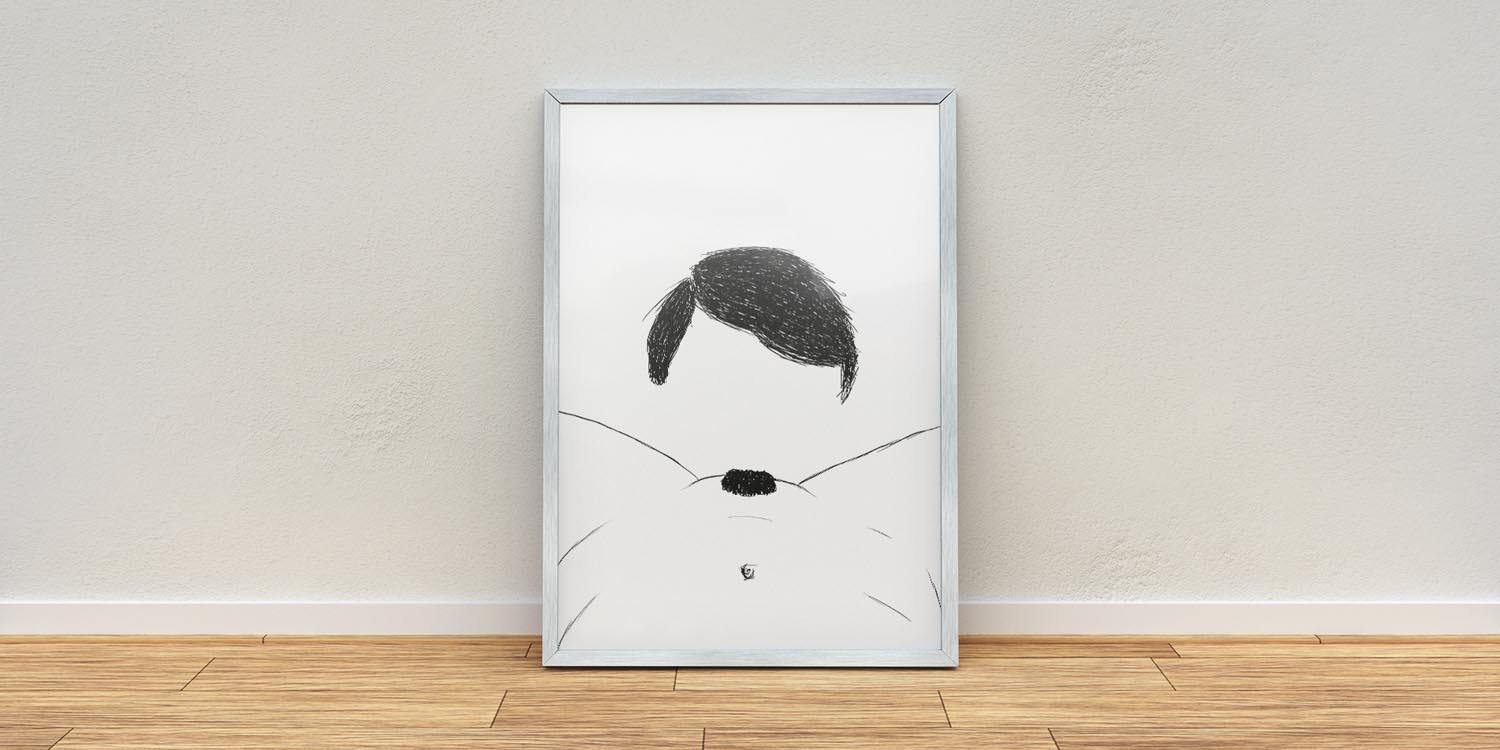
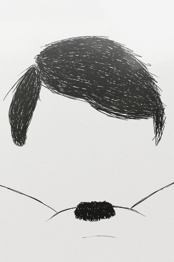
Even though the topic was freedom, and what this means to each of us personally, they stated the following during the briefing: "However, it's not allowed to show any porn or nazi related content on your designs." So, basically we got granted complete freedom and in the next sentence we got a chunk of this so-called freedom taken away.
It's not that I'm so much into designing porn or nazi related stuff, but with their ridiculous definition of freedom, they were basically asking for it. However, I didn't want to be that guy that just shows what is restricted for the sake of it, so I had to think of a more sophisticated way to display these two things, without actually displaying it.
As you can see in the final design, I technically didn't show any porn or nazi stuff, but everyone will instantly get what this poster displays. Strange enough, even though I didn't break their rules, I didn't get selected and my posters was never displayed. I wonder why!
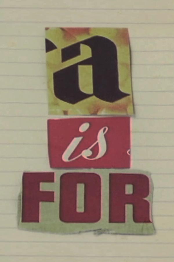
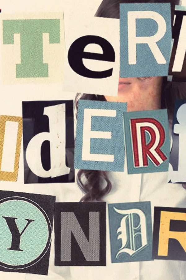
A is for...
Adults! This animation aims to learn the alphabet in a more grown-up way. Unfortunately, after our childhood we will soon enough learn that A isn't just for apples, and B isn't just for butterflies.
Creating Pioneers
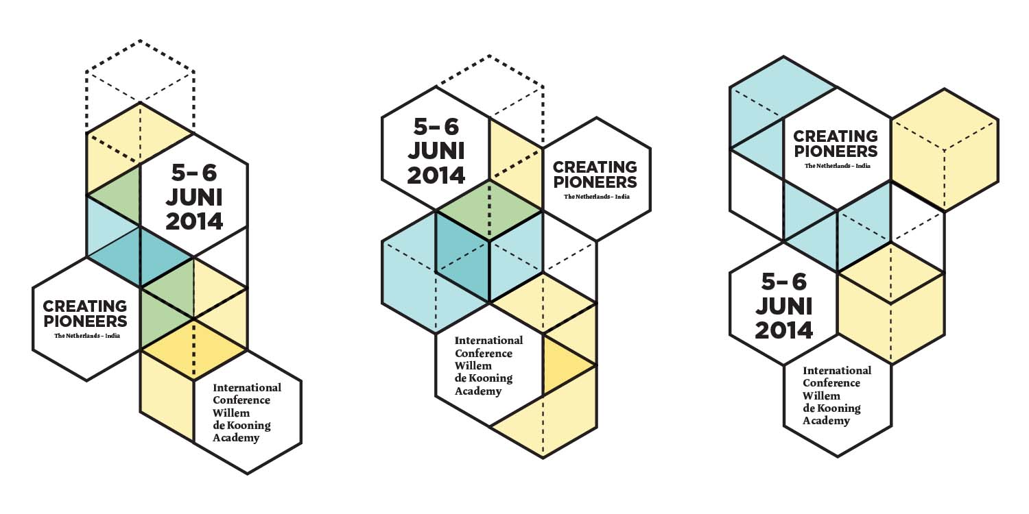
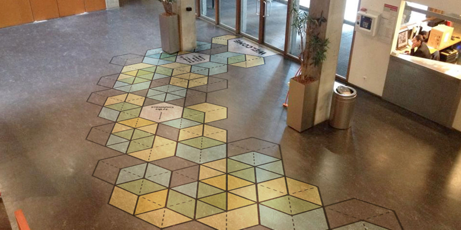
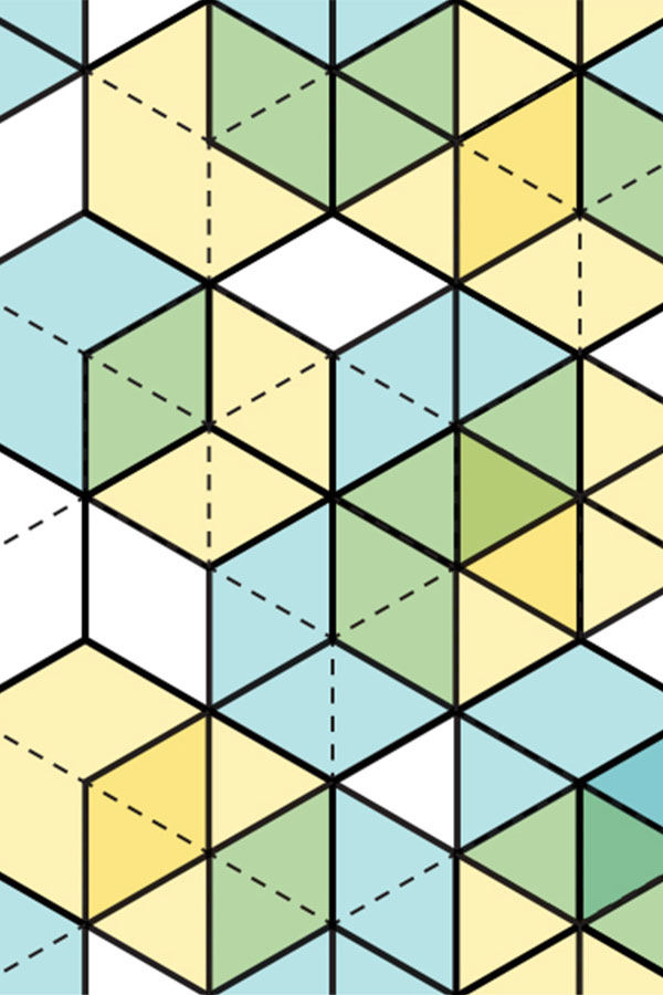
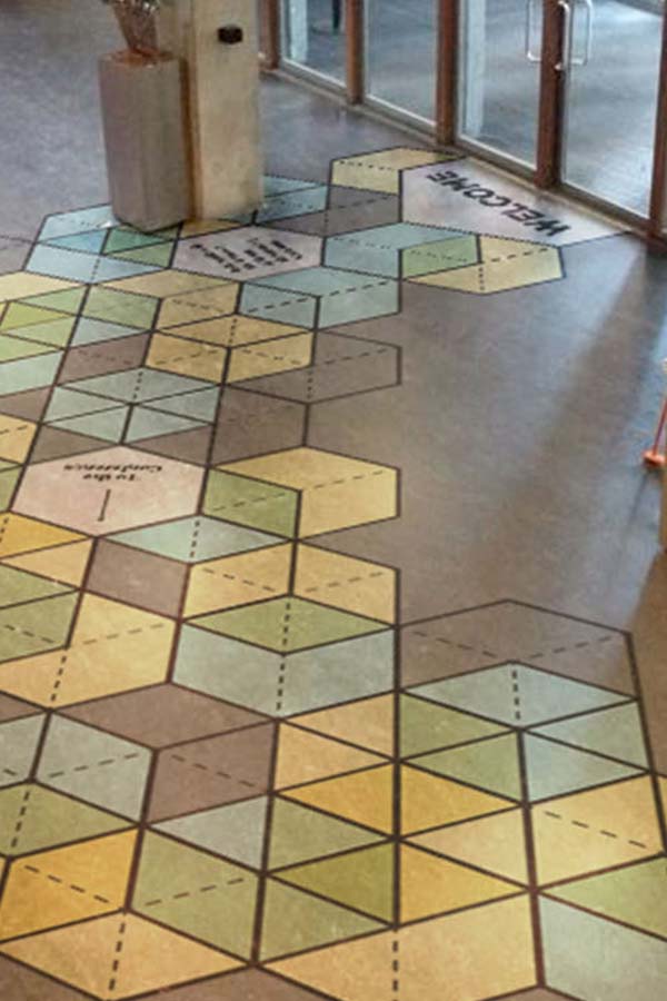
A campaign proposal for an international conference on design, education and business. The main concept we proposed was 'building upon each other's strengths' and designing a toolkit to build all the required graphic works.

Together with Sean Nelissen and Jeroen Pronk, we were asked to design a proposal for the campaign of this conference. Since there was very little time, and another party would eventually design and produce everything, we thought it was smarter and way more efficient to design a set of components. With very simple building blocks, we wanted to create a dynamic identity, stating our 'building upon each other's strengths' statement. It's also a very responsive and easy to work with design tool.
GGD Samen Starten App
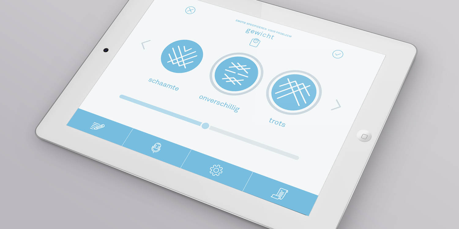
Together with Jamie Groenestein, I made a redesign for GGD's new app 'SamenStarten'. This app is a new approach and a helpful tool during conversations between health care professionals and parents of newborn children.
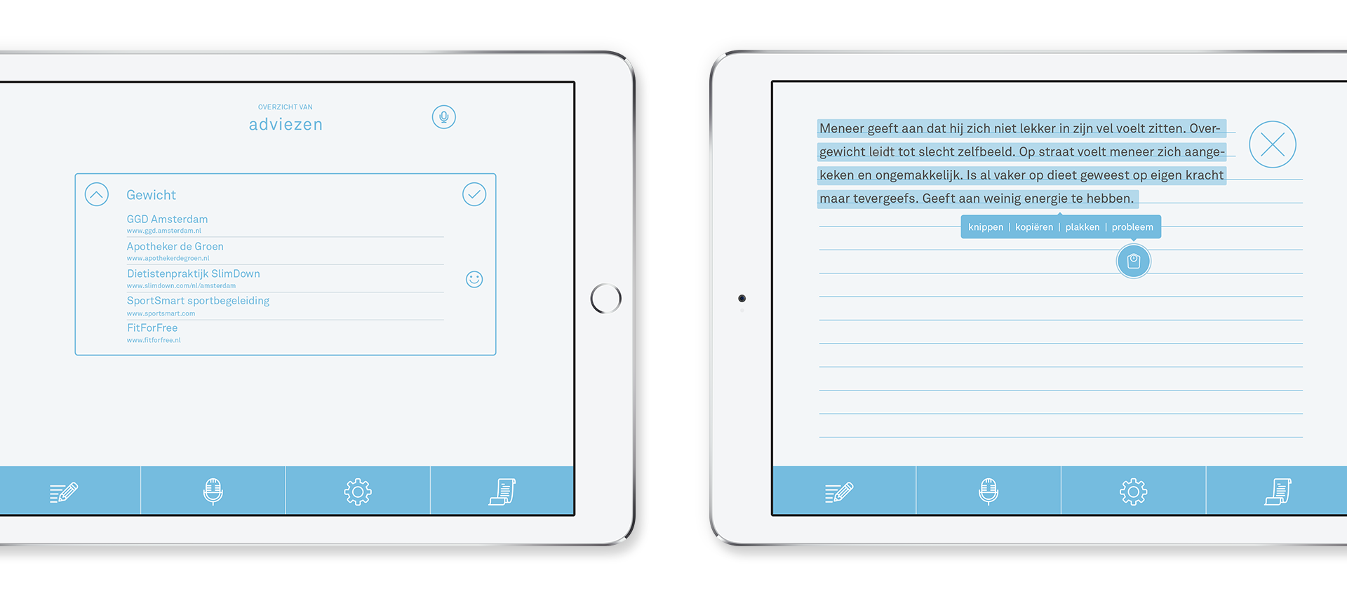
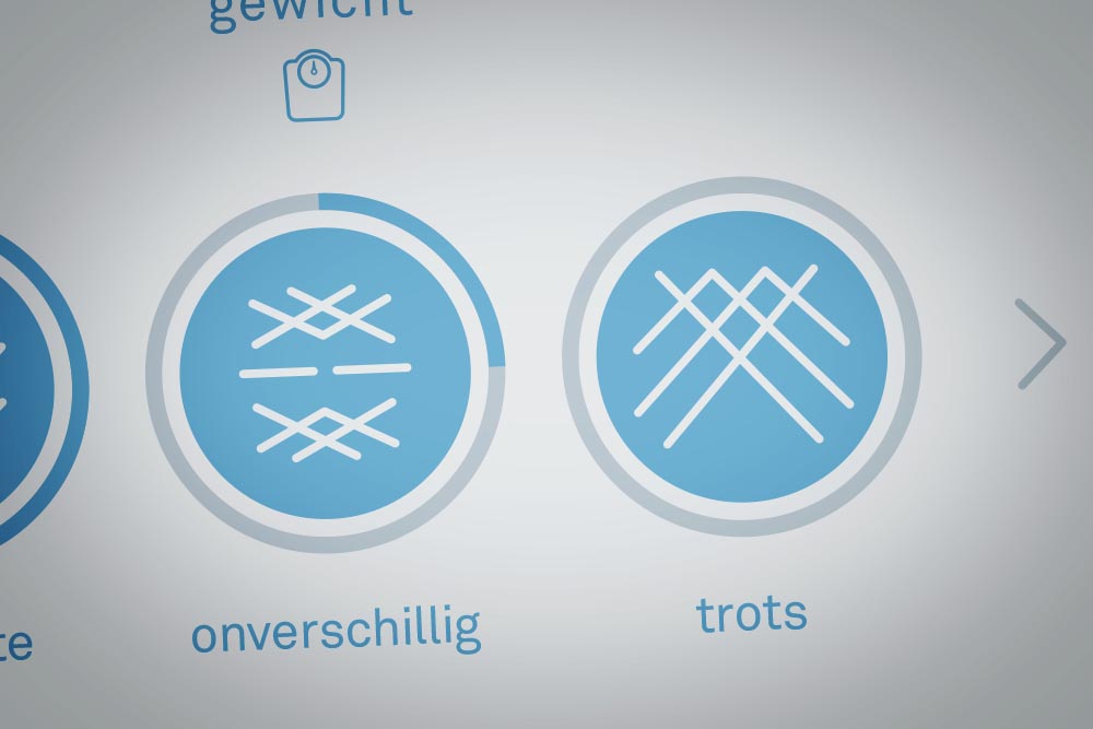
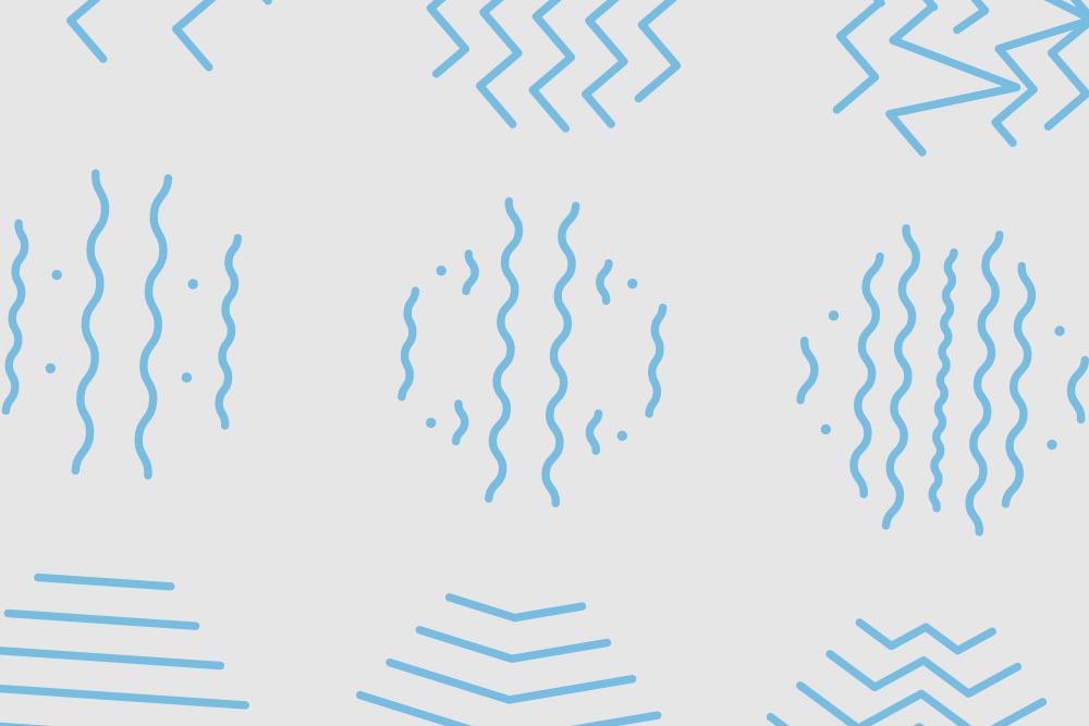
Even though there already was a wireframe, we decided to start from scratch. By doing so, we enabled ourselves to focus each single step in the process on the most crucial part: the parents. We started off by redesigning the app's structure and wireframe. The GGD's initial system of defining emotions and adressing problems were very limiting to us, so we came up with a new, extensive system. For each emotion — and more important, the various gradations — we designed abstract icons to implement in the app.
Since the parents were our main focus, we felt it was important to design the navigation and user experience of the app as clearly as possible. Smooth animations and transitions prevented the user from getting lost by sudden screen switches. We thought if the user goes from one screen to another, this should also be visible. By doing so, it's easier to map the structure of the app. See the animation below to see how our app works in motion.
VR Minor Expo
HIER KOMT NOG EEN BESCHRIJVING

VR Minor Expo
HIER KOMT NOG EEN BESCHRIJVING
